logo

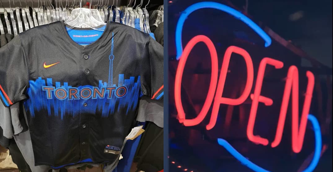
Reasons the Blue Jays City Connect leak may (or may not) be legit

alt
Ian Hunter
1 month ago
It’s been a minute since the Toronto Blue Jays last unveiled a new uniform. Not since Winter Fest of 2020 has the team put out a new uniform variant. Back then, I don’t recall the leaks and speculation running rampant, but this time for the City Connects, it’s gone into overdrive.
To be fair, this has been three years in the making, as the Blue Jays are one of the last teams in MLB to get a City Connect uniform design. Ideas, theories and vision boards have been percolating for a long time, but as the clock ticks down to reveal day on Thursday, fans cannot wait to find out.
The latest “leak” came on Monday via @PaintsbyParkin, and then Blue Jays Twitter took the ball and ran with it. Some people assume it’s the actual City Connect design, others think it’s a misdirect and some kind of fan-inspired prototype.
I hate to tell you, but they’re both right. I’ve gone back and forth on these and there are reasons I believe (and also don’t believe) the leak is legitimate.
For a bit of context, other MLB teams have “leaked” the uniforms days before the official reveal, but the Blue Jays have been tight-lipped about the City Connects, aside from the breadcrumbs they’ve left in the teaser videos.

A precedent of “no leaks”

Prior to the Blue Jays’ powder blue uniform reveal in January 2020, there was no leak before the official reveal. When the Blue Jays overhauled their uniforms in November 2011, someone leaked the eventual redesigned bird logo a few months prior. Not since then has a uniform design gone public before the reveal date by the Jays.
This is the first reason I suspect the leak from Monday is false. Prior uniforms have stayed behind the curtain until show time, and I think that’s by design. Some presume it drums up more PR to leak the uniform to drum up interest, but my take is it’s best to leave it right to the very end.

What about the neon colours?

But then the last teaser video from the Blue Jays on Tuesday swayed me the other way. With a caption: “It’s all in the details”, this one came back with an emphasis on neon signs. I scrubbed this video and couldn’t find any noteworthy screencaps that made me scratch my head.
The red and the blue in the “Open” sign match the piping on the leaked photo. That’s a strange coincidence, isn’t it? There’s one point for the leak.
https://x.com/BlueJays/status/1795530554919498104

Something off about the CN Tower

But looking at the blue skyline on the jersey, something doesn’t seem right. It’s pretty nondescript, and some like @Matttomic have pointed out the CN Tower looks like a landmark from a completely different country. It gives of “Frasier” vibes as well.

Why is there a saying on the collar?

On the other hand, the inside collar of the jersey has “Diversity – Our – Strength” printed. It’s not unusual for other team’s City Connect uniforms to have some sort of saying on the uniform or the cap, and printing it inside the jersey.

The cap and jersey colours don’t quite jive

This next one could swing your opinion both ways, but here’s the leaked cap image that sprung up on Reddit last week compared to the uniform leak from earlier this week. It’s hard to tell with the lighting on the jersey, but it seems more black than navy blue in the cap.
And while the sleeve piping on the jersey sort of matches the red and blue piping on the cap, they’re not quite on track. The lighting may affect how it looks, but the red and blue on the cap look like regular Blue Jays colours, while the red and blue on the uniform are less concentrated with a more pastel hue.

A lack of detail or Toronto-centric Easter Eggs

One last reason I suspect the uniform leak may not be the genuine City Connect uniform is the lack of detail. Most of these uniforms have neat little Easter Eggs about the identity of the city, but that doesn’t look apparent in the front view.
Maybe if we saw the back of the jersey, the inside or the sleeves in more detail, but from head on, it lacks detail and character, frankly. Is it because this has been three years in the making that fans have such a high standard for the City Connect uniforms, but it feels like there should be more to that jersey.

One last Hail Mary for the purple people

There’s a large contingent of Blue Jays fans who are secretly hoping some of these leaks are a misdirect and are actually pointing towards a purple-coloured City Connect uniform. One very faint possibility the Blue Jays were hinting at in the red and blue neon teaser video was that red + blue = purple.
And yet the counter to the purple-centric theory is the Tampa Bay Rays already nailed their City Connects, which prominently feature the colour purple. Not that the Rays have a moratorium over the colour purple, but it might be a bit overkill to have to AL East teams with similar colour palettes.
Unless the Blue Jays post another teaser video between now and Thursday night, we can only speculate about what’s to come. Whether the threads are legitimate, some people love this cap and uniform design, some strongly dislike them.
It’s always hard to please everyone, let alone a fan base that draws on a population base of 30 million people across Canada, not just the nearly 3 million folks in Toronto. At least we’ll have an answer soon enough, but for now, it’s fun to wonder what the real Blue Jays City Connect uniform kit will look like.

Check out these posts...